Free Support Tools and Templates to Streamline Your Processes
Find comprehensive tools to enhance your customer service and IT service management
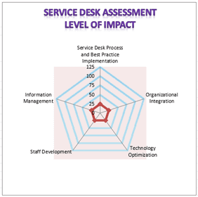
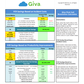
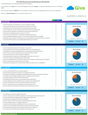
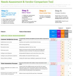
Help Desk and ITSM Assessment and Support Tools
Comprehensive assessments and calculators to evaluate and improve your help desk and ITSM practices
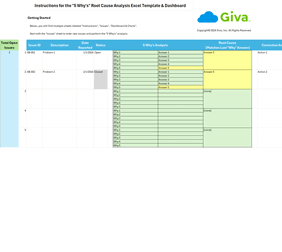
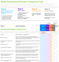
Software Needs Analysis and Assessment Tools
Tools designed to help you evaluate and identify your software requirements effectively


Schedule a demo now, or start your own free, 30-day trial today.
Get free set-up assistance. At no cost to you, Giva's well-trained product experts will answer questions and make setup/configuration recommendations during the 30-day trial.
Start a Free Trial
Get a Demo