7 IT Help Desk Reports Every Manager Should Review Weekly
IT help desk weekly reports give managers a structured view of team workload, SLA compliance, and agent performance from the past seven days. Most help desk tools track dozens of metrics automatically, with dashboards available on demand and reports always a click away. The challenge is knowing which reports actually warrant attention every week and what to do when any of them looks wrong.
This article covers seven specific reports worth reviewing every week, what each one tells you, and how to read them together as a connected system rather than seven separate scorecards.

Key Takeaways
- Why weekly matters: A structured weekly review of seven core reports gives IT help desk managers the visibility to catch staffing gaps, Service Level Agreement (SLA) risks, and quality problems before they escalate.
- SLA compliance benchmark: SLA compliance below 85-90% is a commonly cited service risk threshold, worth tracking week-over-week as a trend rather than just as a weekly snapshot.
- FCR as a quality signal: First Contact Resolution (FCR) rates consistently below 70-75% typically indicate gaps in agent training, knowledge base coverage, or ticket routing accuracy.
- CSAT and FCR can conflict: A high FCR rate combined with falling Customer Satisfaction (CSAT) often means tickets are being closed too quickly rather than resolved thoroughly.
- Reopened ticket rate: A rising reopened ticket rate is an early sign that resolution quality is slipping, often weeks before CSAT scores start to reflect the problem.
Why the Weekly Review Cycle Works
Weekly is the right cadence for most of these reports because it's short enough to catch developing problems before they compound, but long enough for patterns to emerge from daily noise. Daily reviews work well for live dashboards (monitoring open tickets and active SLA risk in real time), but they're too granular for the kind of trend analysis that drives staffing and training decisions. And monthly reviews are too slow. By the time a monthly report flags a backlog issue, the problem has usually been building for weeks.
The pattern most managers recognize in hindsight is a slow one. An SLA compliance rate can drift from 92% to 86% over five weeks, never once triggering an alarm because each individual week's drop was small. A ticket backlog can grow by a dozen items a week for two months until it's suddenly a staffing escalation. Neither problem starts as a crisis. Both start as a trend, and trends are what weekly reviews are designed to catch.
The weekly review doesn't have to take long. Once the habit is established and the reports are in one place, reviewing all seven takes most managers 30-45 minutes. The return on that time tends to show up the first time a metric flags something before it becomes a user complaint.
7 IT Help Desk Reports Every Manager Should Review Weekly
-
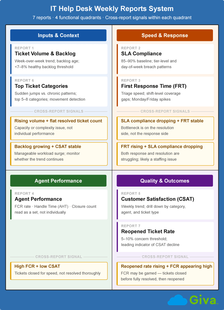
Ticket Volume and Backlog Report
The ticket volume and backlog report is the baseline for everything else. It shows how many incoming tickets were created, how many were resolved, and what the net backlog looks like at the end of the week. Without that context, the other reports are harder to interpret. A rising Average Handle Time (AHT), for instance, looks very different depending on whether ticket volume is up or down.
The number to track week-over-week is the backlog trend, not just the snapshot. A backlog that grows by 15 tickets in a week doesn't tell you much on its own. Three consecutive weeks of 15-ticket growth tells you that the number of tickets your team is resolving per week isn't keeping up with demand, and that's typically the point where a staffing adjustment or capacity planning conversation is necessary. Most teams cite a healthy backlog as somewhere under 7-8% of weekly ticket volume, though that reference point varies by team size and SLA structure. The direction matters more than any specific threshold. Flat or decreasing is manageable, but consistently increasing means something needs attention.
-
SLA Compliance Report
The SLA compliance report shows what percentage of tickets were resolved within the committed timeframe, typically broken down by priority level. To calculate it, divide the number of tickets resolved within SLA by the total tickets in the measurement window, then multiply by 100. What makes this worth reviewing weekly rather than monthly is that SLA compliance problems usually start as small, concentrated patterns, not a broad decline across the board.
A compliance dip that looks minor at the aggregate level often hides something specific underneath. The breach pattern usually falls into one of three forms:
- Concentrated in one priority tier, where the resolution window for that level is consistently too tight.
- A single ticket category that keeps missing its resolution window week after week.
- Slippage that tracks to a particular day of week, usually tied to a staffing or coverage gap.
Cross-referencing against the First Response Time (FRT) report helps narrow down which type you're dealing with. If FRT is holding steady while compliance drops, the problem is on the resolution side, not the response side. Pinpointing which of the three patterns applies is the starting point for any SLA breach root cause analysis.
-
First Response Time (FRT) Report
First Response Time is measured as the average first response time to new tickets opened during the week. It captures how quickly an agent first acknowledges a new ticket, not how long the full resolution takes. That distinction is important because a team can have fast first response and slow resolution, or the reverse, and reviewing FRT separately from SLA compliance is what lets you locate where in the service cycle a problem is actually occurring.
The warning signal most managers miss is FRT creeping up over several weeks while ticket volume stays flat. That pattern usually means triage is the bottleneck, with tickets sitting unassigned or unread longer than they should.
Segmenting FRT by day of the week and time of day is often more useful than looking at the weekly average, because coverage gaps tend to be shift-specific. Monday mornings and Friday afternoons are the most common windows where FRT spikes, and where adjusting coverage or auto-assignment rules tends to have the biggest effect.
-
Agent Performance Report
The agent performance report is built around three per-agent metrics:
- First Contact Resolution (FCR) rate
- Average Handle Time (AHT)
- Ticket closure count for the week
None of them tells a complete story on its own, but reading them together reveals patterns that individual numbers don't.
AHT is the metric most likely to be misread. An agent whose AHT is rising while their closure count is dropping could be struggling, or they could be working through a set of genuinely complex tickets. However, there's no really clean way to benchmark AHT across teams because ticket complexity varies too much by organization, industry, and time of year. Before using AHT data in a coaching conversation, check whether the agent's ticket mix changed that week. If it did, rising AHT may mean the work got harder, not that performance slipped.
FCR is the more reliable quality indicator. Benchmarking data from MetricNet documents FCR performance across IT support organizations ranging from roughly 70% to 97%, depending on training investment and technology adoption. A rate consistently below 70-75% on your team usually points to a training gap, a knowledge base gap, a routing accuracy problem, or some combination of the three.
When an agent has low FCR and high AHT alongside a below-average closure count, all three metrics point at the same problem. The agent is spending more time than normal on tickets and still not resolving them on first contact, which usually means a skill gap or routing mismatch. The opposite combination is also worth watching. High closure count paired with low AHT and low FCR means tickets are being moved quickly but not thoroughly. Both tend to look acceptable in aggregate metrics until the reopened ticket rate or CSAT scores catch up.
-
Customer Satisfaction (CSAT) Report
The CSAT report tracks scores from customer satisfaction surveys sent automatically after a ticket closes. Weekly trending matters more than any individual score. A CSAT of 4.1 this week is hard to interpret on its own. A CSAT that has dropped from 4.4 to 4.1 over three consecutive weeks means something is changing and is worth figuring out what.
When CSAT drops, the most useful step is pulling the actual tickets behind the low scores and looking for a pattern. For example:
- A dip tied to a specific ticket category usually signals a script or process gap
- A dip tied to a specific agent is a coaching conversation
- A dip that tracks to a particular support channel suggests the experience is inconsistent depending on how users reach out
CSAT without that level of drill-down is just a score. The pattern is what tells you where to look.
-
Top Ticket Categories Report
The top ticket categories report shows ticket volume by issue type, typically the top 5-8 categories for the week. It's most useful not as a snapshot but as a movement detector. A category that holds at position 3 for six weeks isn't news. A category that jumps from position 8 to position 1 in a single week usually signals that something changed:
- A software rollout that didn't go cleanly.
- A new hardware deployment generating user confusion.
- A policy change that users haven't absorbed yet.
The categories that warrant longer-term attention are the ones that stay in the top 3 for weeks without decreasing. Those recurring issues don't need faster resolution times. They need elimination through knowledge base articles and self-service portal content, or through a formal investigation to find and remove the underlying cause.
-
Reopened Ticket Rate
The reopened ticket rate measures what percentage of resolved tickets get reopened within a set window, typically seven days after closure. It's a direct measure of resolution quality, which makes it one of the most undervalued metrics on this list. A ticket that gets reopened twice wasn't actually resolved. It was closed.
A reopened rate above 5-10% is commonly cited as a service quality concern, though the threshold varies by ticket type and industry. The more useful analysis is the segmented one. Which categories and which agents are generating the most reopened tickets? Those patterns reveal where premature closure or incomplete fixes are most common.
Tracking reopened ticket rate alongside CSAT in the same weekly review is particularly useful. A week where reopened tickets climb is typically a leading indicator of a CSAT drop a few weeks later. The users who reopen tickets are more likely than average to respond to satisfaction surveys, and their scores tend to be lower. Catching the trend in reopened tickets first gives you time to investigate before it shows up in CSAT.
Reading These Reports as a System, Not in Isolation
Each of these reports answers a specific question. But the more useful skill is reading them together, because when two reports move in opposite directions, the combination tells you something that neither one can tell you alone.
Some of the most common cross-report patterns to watch for:
Cross-Report Signal |
What It Indicates |
High FCR + low CSAT |
Tickets are being closed for speed, not resolved thoroughly. |
Rising volume + flat resolved ticket count |
Number of resolved tickets isn't keeping up with demand; a capacity or complexity issue, not individual performance. |
SLA compliance dropping + FRT stable |
Bottleneck is on the resolution side, not the response side. |
Backlog growing + CSAT stable |
A manageable workload surge; monitor whether the trend continues. |
Reopened rate rising + FCR appearing high |
FCR may be gamed - tickets closed before fully resolved, then reopened. |
FRT rising + SLA compliance dropping |
Both response and resolution are struggling; likely a staffing or capacity problem. |
The value of reviewing all seven reports in the same sitting, rather than checking each one at a different point during the week, is that the relationships between them become visible. A manager who reviews CSAT one day, SLA compliance the next, and agent performance on a third day will miss the combination that matters. The weekly review is most useful as a single block where all seven reports are open at once.
IT Help Desk Weekly Reports System Diagram
Frequently Asked Questions About IT Help Desk Weekly Reports
-
How often should IT help desk managers review reports?
Most IT help desk managers benefit from a layered review schedule with different cadences for different report types.
Daily dashboards handle real-time visibility and are built for triage. Weekly reports, the seven covered in this guide, are the right tool for trend analysis and tactical management decisions. Monthly reports cover channel performance and prior-month comparisons. Quarterly reviews are typically aimed at leadership and cover outcome metrics and capacity planning.
The most common failure mode is using the weekly reports as a substitute for a daily dashboard, or treating monthly reports as a replacement for a weekly review. Each serves a different purpose and shouldn't replace the others.
-
What is a good SLA compliance rate for an IT help desk?
A commonly cited baseline for IT help desk SLA compliance is 85-90% or higher, though the right target depends on what your SLAs actually commit to.
An SLA that guarantees four-hour resolution for all priority tickets is harder to maintain consistently than one with tiered windows by priority level. Teams with well-designed, tiered SLAs often report compliance rates of 90-95%. Teams with aggressive flat SLAs may find 85% a more realistic operational target while they improve process. The benchmark matters less than the trend. Holding steady at 88% for three months is a very different situation from dropping from 95% to 88% over the same period.
-
What is the difference between a weekly help desk report and a dashboard?
A dashboard shows real-time or near-real-time data; a report is a snapshot over a defined period, designed for review and action rather than live monitoring.
Dashboards are useful for triage and immediate response. Think of a manager checking at 2 PM to see how many priority tickets are open and whether any are close to an SLA breach. Reports are for stepping back, reviewing what the week looked like, and making decisions about process, staffing, or training. Both have a place, but they answer different questions and shouldn't be confused for each other.
-
How should I share weekly help desk reports with leadership?
The key is tailoring the output to what each audience actually needs, not sending the same raw report to everyone.
Team leads and direct managers typically need operational detail:
- Agent-level performance and any outliers worth a coaching conversation.
- Specific SLA categories that are trending up or down.
- Ticket category movements from the prior week.
Directors and department heads typically want trend lines and summary metrics, such as whether SLAs are improving or declining and whether any patterns merit attention. Executives and non-technical stakeholders generally want outcome metrics and business impact, including cost-per-ticket trends and IT performance relative to user productivity. Setting up a recurring automated distribution schedule makes this sustainable as a habit rather than a weekly manual task.
Related Giva Resources
- Help Desk Metrics
- Measuring Success: Service Level Agreements (SLA) Compliance Reports
- Why Your IT Help Desk Tickets Keep Getting Reopened
Your IT Help Desk Weekly Reports: From Metrics to Smarter Decisions
The reports that tend to give the earliest warning signals are the ones most managers spend the least time on. The reopened ticket rate is under-reviewed on most teams but is often the first metric to move when resolution quality starts slipping. The FRT report is easy to skip when SLA compliance looks fine, but it's where coverage gaps show up before they become SLA problems. Those leading indicators are only visible if you're looking for them consistently.
The value of a weekly review isn't any individual number. It's the pattern those numbers make over time and the way they relate to each other. A single week's CSAT score tells you almost nothing. Eight weeks of CSAT data, read against ticket categories and agent performance, tells you a lot. Keeping that weekly review habit is what turns help desk reporting into a data-driven management practice rather than a historical record.
Get More from Your Help Desk Data with Giva
Managing a weekly review effectively depends on having the right tools underneath it. When your reporting is scattered across multiple systems, putting together a clear weekly picture takes more time than it should.
Giva's Help Desk Software brings ticket volume, SLA compliance, agent performance, and customer satisfaction data into a single reporting view, so the weekly review becomes a decision-making exercise rather than a data assembly project.
The reporting suite includes pre-built dashboards for the core weekly metrics covered in this guide, plus the flexibility to build custom reports around your team's specific priorities. If your organization operates under strict SLAs or HIPAA compliance requirements, Giva's audit logs and SLA tracking tools keep the most critical data visible and audit-ready.
Every manager's weekly review is only as useful as the system generating the data. When that data is accurate, timely, and accessible in one place, a 30-minute weekly review gives you more than a 90-minute data archaeology session ever could.
To learn more about how Giva can help your support team, get a demo to see Giva's solutions in action, or start your own free, 30-day trial today!


Categories: Help Desk