Help Desk Reporting: How to Match the Right Report to the Right Audience
A new IT manager inherits a mandate to "get reporting sorted" and opens the help desk platform's reports tab. Forty templates stare back, half of them named things like "Ticket Backlog v2" and "Agent Scorecard (Legacy)." Meanwhile, leadership is already asking what the team actually did last week, and there isn't a single report ready to answer that question at the right level of detail.
That gap is the actual problem help desk reporting solves. This blog post covers what help desk reporting actually means, the report types worth knowing, how often each one should run and who it is for, and how to build a reporting practice from nothing without drowning the team in dashboards nobody reads.
Note that in this case, the same information applies whether your team is called a help desk, a service desk, or an internal IT support function, since what changes is the vocabulary rather than the audiences or the cadence. See our article on Help Desk vs. Service Desk vs. ITSM for more on the various types of support structures.

Key Takeaways
- Report frequency should align to the audience, not be based on habit: A live queue view serves an agent moment to moment. A weekly report serves a manager's operational review. A leadership summary only needs a handful of numbers, a few times a year.
- A dashboard and a report solve different problems: A dashboard shows what's happening right now. A report packages a slice of that data on a schedule so someone can review it, compare it to last period, and decide what to do next.
- Report type and report frequency are two different questions: What a report measures, such as Service Level Agreement (SLA) compliance or ticket volume, is a separate decision from how often anyone actually needs to see it. Treating them as one choice is how teams end up sending the same PDF to an agent, a manager, and a director.
- More reports rarely means better reporting: Teams that keep adding metrics out of a fear of missing something usually end up with output nobody reads and nobody acts on. A smaller set of reports people actually open is better than a comprehensive one that stays unread.
What Is Help Desk Reporting?
Help desk reporting is the practice of turning raw ticket and support activity data into structured documents and views that different audiences use to make decisions. That covers everything from a live queue an agent checks between tickets to a one-page summary a director reads once a quarter.
Three related terms get used almost interchangeably, and the mix-up causes real confusion when teams start building a reporting practice:
- Help desk metrics are the individual numbers, things like first response time or ticket volume
- Help desk reports are the packaged, scheduled documents built from those numbers for a specific audience
- Dashboards are live, unscheduled views of the same underlying data, built for checking in rather than for review
Help Desk Report vs. Dashboard: What's the Difference?
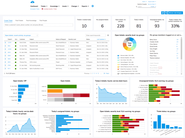
A dashboard is a live, pull-based view. Someone opens it to see what's happening right now, and the numbers update continuously as new tickets come in and get resolved. It's built for triage, not analysis.
A report is periodic and push-based. It gets generated on a schedule, whether that's daily, weekly, or monthly, and it's built for review, comparing this period to the last one, spotting a trend, or deciding whether something needs to change. A simple chart or graph usually does more work here than another table of raw numbers, since a trend line is easier to read at a glance than row after row of data.
|
Dashboard |
Report |
|---|---|---|
Update Frequency |
Continuous, real time |
Fixed schedule (daily, weekly, monthly) |
Primary Use |
Triage and monitoring in the moment |
Review, comparison, and decisions |
Typical Audience |
Agents and team leads |
Managers, directors, and executives |
The 5-Tier Reporting Schedule: Matching Reports to Their Audience
Data trust is a broader problem than help desk reporting alone, but it shows up here just as often. A survey from Precisely and Drexel University's LeBow College of Business found that 76% of organizations call data-driven decision-making a top goal, yet 67% still don't completely trust the data they're using to get there, up from 55% just a year earlier. Sending the same report to an agent, a manager, and a director and calling it done is one of the more avoidable reasons why.
The following breaks help desk reporting into five tiers, from the fastest-moving to the least frequent:
-
Tier 1: Real-Time Dashboards (Agents and Team Leads)
The real-time tier is a live queue view showing open tickets, current backlog, which tickets are at risk of breaching their SLA right now, and how each new ticket is tracking against its First Response Time (FRT) target. Agents and team leads use it to decide what to work on next, not to analyze anything.
Nothing at this tier gets saved or emailed. If a number needs to be compared to last week's number, that's a different tier entirely.
-
Tier 2: Daily Snapshots (Team Leads and Shift Supervisors)
A daily snapshot is a short digest covering yesterday's ticket volume, whatever backlog carried over into today, and any tickets moving past their target date. It's built for a shift handoff or a morning check-in and not a deep review.
Team leads use this tier to catch a problem within a day of it starting rather than finding out a week later that Monday's volume spike never actually got cleared.
-
Tier 3: Weekly Operational Reports (Managers)
A week is long enough for a real pattern to show up above the day-to-day noise, and short enough that a manager can still do something about it. That's the whole case for reviewing help desk performance on a weekly schedule instead of daily or monthly. For the specific reports worth checking every week, and how to read them together instead of one at a time, see our article 7 IT Help Desk Reports Every Manager Should Review Weekly, which walks through ticket volume, SLA compliance, agent performance, and four other reports that make up a manager's weekly review.
-
Tier 4: Monthly Trend Reports (Managers and Directors)
Monthly reports zoom out far enough to show a trend line instead of a single week's snapshot. These can be, for example, Customer Satisfaction (CSAT) drifting over eight weeks, an SLA compliance rate creeping down a few points a month, or a training gap showing up as a pattern rather than a one-off. This tier is where coaching and process decisions usually get made. For the granular, agent-level numbers that feed a monthly trend report, see Help Desk Metrics.
-
Tier 5: Executive Summary Reports (Leadership, Quarterly or As Needed)
An executive summary has one job, and that is telling leadership whether the help desk is performing and whether anything needs their attention. It strips out almost everything an agent or manager would need and keeps only what changes a budget, staffing, or software decision. This is why a financial figure like cost per ticket often carries more weight here than it does at any other tier. For the strategic-level Key Performance Indicators (KPIs) that typically feed this tier, see our article Most Important Operational Metrics & KPIs.
A quarterly executive summary for a mid-size IT help desk might read something close to this: "The team closed 94% of tickets within SLA this quarter, up three points from last quarter. Customer satisfaction held steady at 4.6 out of 5. The largest single driver of ticket volume remained password resets, and a self-service reset tool is scheduled to launch next quarter to address it." That's three numbers, one trend, and one recommendation. It's not a spreadsheet, and it's not meant to be.
How it gets presented matters almost as much as what's in it. Leading with the recommendation, then backing it up with the three or four numbers that support it, holds a director's attention far better than opening with a page of data and building up to a conclusion at the end.
None of this is about hiding information from leadership. It's about matching the report to the decision an executive is actually there to make, the same logic that puts a live queue in front of an agent instead of a quarterly trend line.
The 5 Reporting Tiers at a Glance
Tier |
Audience |
Frequency |
Primary Purpose |
Example Report |
|---|---|---|---|---|
1. Real-Time |
Agents, team leads |
Continuous |
Triage |
Live queue / SLA-at-risk view |
2. Daily |
Team leads, shift supervisors |
Daily |
Catch problems early |
Volume and backlog snapshot |
3. Weekly |
Managers |
Weekly |
Operational review |
SLA compliance, agent performance |
4. Monthly |
Managers, directors |
Monthly |
Trend and coaching signal |
CSAT trend, SLA rate over time |
5. Executive Summary |
Leadership |
Quarterly or as needed |
Strategic decisions |
One-page summary with a recommendation |
6 Common Help Desk Report Types
The five tiers above are about how often a report runs. The following six report types are about what a report actually measures, and each one can show up at more than one tier depending on the audience:
- SLA Compliance Report: Shows what percentage of tickets were resolved within their committed timeframe, usually broken down by priority level and tracked alongside Mean Time to Resolution (MTTR). It's the report most likely to trigger an escalation conversation when the number slips.
- Agent Performance Report: Built around First Contact Resolution (FCR) rate, Average Handle Time (AHT), and ticket closure count by agent, often alongside how evenly workload is distributed across the team. Again, see Help Desk Metrics for the full list of low-level, agent-based numbers this report can draw from.
- Ticket Count by Category: Breaks ticket volume down by issue type, usually the top five to eight categories for the period. A spike in one category is often the clearest early signal of a training gap or a new system problem.
- Ticket Volume and Backlog Report: Tracks how many tickets came in, how many got resolved, and what's left in the queue. It's the baseline number almost every other report gets compared against.
- Customer Satisfaction (CSAT) Report: Pulls scores from post-resolution satisfaction surveys. Worth reading alongside FCR rather than on its own, since a high FCR and a falling CSAT together usually mean tickets are getting closed fast rather than resolved well.
- Ticket Aging Report: Flags tickets that have been open longer than their target resolution window, independent of whether they've technically breached SLA yet. It's often the clearest early sign of a workflow bottleneck, since aging tickets tend to cluster around the same category or the same overloaded queue well before SLA numbers show it.
How to Build a Help Desk Reporting Practice From Scratch
Starting a reporting practice from nothing goes better as four deliberate steps than as one attempt to set up everything all at once:
- Identify your audiences and what each one decides: Name the two or three people who will actually read your output, and what decision each one makes with it. For instance, an agent triaging a queue, a manager planning next week's staffing, and a director justifying next year's budget need different reports, not the same report at different lengths.
- Start with one or two reports per tier: Pick one or two reports per tier rather than trying to build all five tiers on day one. Start with whichever tier currently has the biggest blind spot, often the weekly or monthly tier if a team has only ever had access to live dashboards.
- Automate collection wherever the platform supports it: A manually exported spreadsheet works for the first month and then quietly stops happening the first time the person who owns it goes on vacation or gets busy. Scheduled, automated reports survive a busy month, but manual ones usually don't.
- Review and retire what nobody uses: Revisit every report after a full quarter and cut anything nobody has opened. A reporting practice that only ever adds reports and never removes one eventually becomes the exact problem it was built to solve.
Avoiding the "Reporting for Reporting's Sake" Trap
A team that just inherited the reporting mandate often overcorrects in the other direction. Afraid of missing something, they add a metric for every stakeholder request and a report for every tool the platform happens to offer. Within a couple of months, the reports tab has thirty entries, most of them unopened, and the one report a manager actually needs is buried on page three.
There's no clean, universal number for how many reports a help desk should have. It depends on team size, ticket volume, and how mature the reporting practice already is, and there's no industry benchmark that applies evenly across all three. What does hold up across teams is cutting before adding, and treating an unopened report as a signal to remove it.
A report that doesn't point to a specific next action rarely survives past its first quarter. The fix is ending each one with what to do next and who owns doing it, even if the honest answer some weeks is just "keep watching this number."
AI and Automated Insights in Help Desk Reporting
A 2025 survey from ITSM.tools, conducted with HCLSoftware, found that analytics and reporting was the single most common top AI use case cited by ITSM professionals, named by 20% of respondents, ahead of virtual agents for end-users at 18% and incident management at 17%.
The practical version of this today is narrower than the marketing around it. A system that flags an unusual spike in a specific ticket category before a human notices it in a weekly report, or one that drafts a plain-language summary of what changed since the last reporting period so a manager isn't starting from a blank page, does more real work than the phrase "AI-powered insights" usually implies. Neither replaces judgment about what to do with the finding, but both cut down the time spent finding it.
A natural-language query layer is the other piece worth watching. Instead of building a custom report for every one-off question, someone can ask a plain question, such as which category drove last week's volume increase, and get an answer pulled directly from the underlying ticket data.
Help Desk Reporting FAQs
-
What is help desk reporting?
Help desk reporting turns everyday ticket activity, things like volume, response times, and satisfaction scores, into scheduled reports and live dashboards that agents, managers, and leadership each use differently.
An agent mainly needs the live version. A manager and an executive mainly need the scheduled version, just at a different level of detail.
-
How often should help desk reports be reviewed?
It depends on the audience, not a fixed rule. Agents need real-time visibility, managers get the most value from weekly and monthly reviews, and executives typically only need a summary quarterly or when something changes materially.
See the 5-tier breakdown above for what each audience should actually be looking at.
-
What is a good SLA compliance rate to report on?
A commonly cited baseline for help desk SLA compliance is 85-90% or higher.
A sustained rate below that range is usually treated as a service risk worth investigating, though the right target still depends on your specific SLA commitments and ticket mix.
-
Should executives see the same help desk reports as managers?
Executives generally need a different report than managers, not a shorter version of the same one. A manager's weekly report is built to catch operational problems early. An executive summary is built to answer whether the team is meeting its goals and whether leadership needs to act, which usually means three or four numbers and a recommendation rather than a full operational breakdown.
Sending a manager's full weekly report up to leadership unedited is one of the more common reasons executive summaries go unread.
Related Giva Resources
- Ticket Reopen Rate: Causes and Fixes
- Measuring Success: SLA Compliance Reports
- IT Help Desk Ultimate Guide
Building a Help Desk Reporting Practice That People Actually Use
Reporting practices don't fail because a team has too few reports. They fail because the reports that do exist are going to the wrong audience at the wrong frequency, so nobody reads them and the team quietly reverts to gut instinct.
Getting it right doesn't require more data than most help desks already have. It requires matching what already exists to the tier and the audience it was actually built for, and being willing to retire whatever doesn't earn its place.
Putting the Right Report in Front of the Right Person
A reporting practice is only as good as the last report someone actually opened.
Giva's Help Desk Software and ITSM Software are built with that structure in mind. Real-time dashboards give agents and team leads the live queue view they need for triage, while Customized Reports in 3 Easy Clicks™ let managers and executives configure the weekly, monthly, or executive-level report they need without waiting on IT or a dedicated analyst.
That same logic carries into the product. Customer surveys feed the CSAT numbers a monthly trend report tracks, and reports go out on whatever scheduled basis a tier calls for, daily, weekly, or quarterly, without anyone filing a request with IT.
From here, the fastest way to know if this fits your team is to see it running against your own tickets, not a hypothetical one.
Get a demo to see Giva's solutions in action, or start your own free, 30-day trial today!



Categories: Help Desk